October 01, 2017
Demystifying Our New Logo
Like all logos, the logo for the Church of the Transfiguration (affectionately known as “The Little Church Around the Corner”) has meaning that is represented by shapes, symbols and colors. The words, which are integral to the logo, give homage to Transfiguration’s long-standing relationship with actors and the Episcopal Actors Guild. “How We Became ‘The Little Church Around the Corner’”.
The logo was designed and released in the Fall of 2017, which coincided with the launch of a new website design. It is used online and on correspondence/materials for the Church.
Shapes
The overall basic shape of the logo resembles the beauty of the many stained glass windows that are a hallmark of Transfiguration. The well-recognized and prominent shapes of the logo not only represent commonly known Christian figures, but they also have special meaning at Transfiguration.
The most basic of shapes – the Circle – is the symbol of eternity and neverending existence. The circle represents not only the perfection of God, but God as an everlasting God. There are circular stained glass windows throughout Transfiguration.
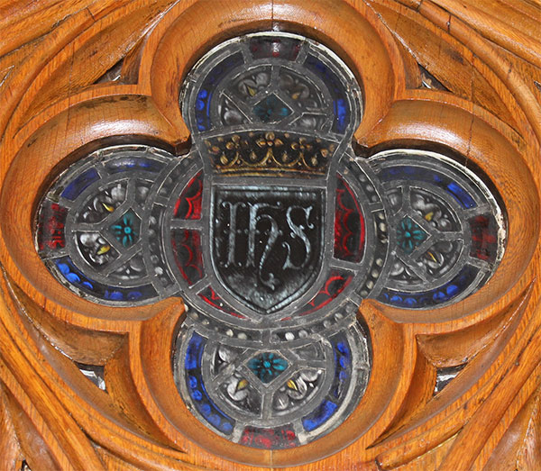
The Quatrefoil (French with a Latin derivative for “four leaves”) shape consists of four partially overlapping circles of the same diameter. This symbol often represents the four physical elements (earth, water air and fire) and the four cardinal directions (north, south, east and west). In religious settings, the Quatrefoil symbolizes the four Gospels – Matthew, Mark, Luke, and John – which overlap one another partially but not entirely. In general, this shape represents inclusivity and can also be found prominently as a stained glass window over the Church’s entryway (see below).
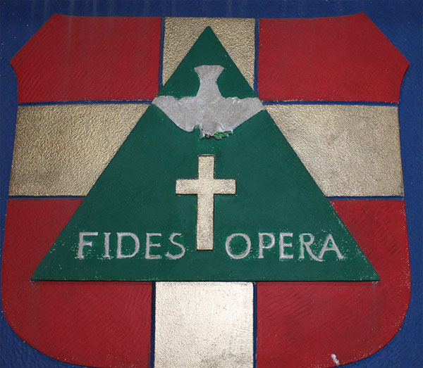
The Triangle is often used in Christianity as a symbol for the Holy Trinity – Father, Son, and Holy Spirit. A triangle pointing up demonstrates a strong foundation and sense of stability. The triangle – in fact, a green triangle – adorns the Rectory entryway (see below) with the inscription of Transfiguration’s mission Fides Opera (“Faith in Action”)*. The logo triangle also resembles one of Transfiguration’s most noted structural components, the lychgate.
These shapes – the circle, quatrefoil, and triangle – are also found as the central design of the welcoming sign (see below) in the garden of Little Church.
Symbols
The symbols of the logo – the Dove and the Cross – are synonymous with basic Christian beliefs in the Holy Spirit and Jesus Christ.
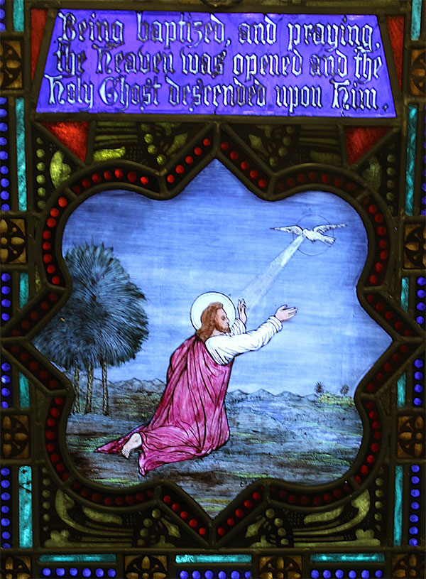
The white Dove represents the Holy Spirit. The dove has divine meaning in both the Old and New Testaments. One of the most beloved stories in the Hebrew Scriptures is the account of Noah sending out a dove three times to determine if the flooding had receded and if it was safe to leave the ark (Genesis 8:8-12). The dove grew to represent God’s presence and love for humankind. In the New Testament, images of the dove are recorded in the Gospels at Jesus’ baptism, when the Holy Spirit of God came upon him “like a dove” (Matthew 3:16, Mark 1:10, Luke 3:22, and John 1:32). In many artistic renditions of the Trinity, the Holy Spirit is depicted as a white dove, as in the case of one of Transfiguration’s stained glass windows that is pictured below.
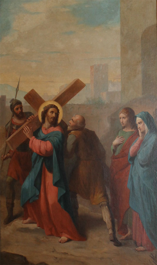
The symbol of the Cross is the most sacred of all Christian symbols. The Cross represents the crucifixion of Jesus Christ, which is the foundation of the belief that Jesus died on the cross to redeem humanity. The image of the Cross is found throughout Transfiguration, and the depictions of the events of Jesus’ crucifixion are well represented in a magnificent set of Stations of the Cross (see below), which are significantly displayed along the side aisles of Transfiguration. A cross also leads the processions on Sundays, and crosses adorn the altars at Transfiguration.
Colors
Colors used in the Transfiguration logo show the parish’s reverence for the love of God and his Divine majesty. Many of the colors used in the logo are also representative of seasons throughout the liturgical year.
- Gold is used throughout the logo to outline each distinct shape. Gold is the emblem of the sun and of divinity.
- The color Red in the corners of the logo represents fire and blood, especially blood of martyred saints.
- The color of the perfect Circle representing the infinity of God is Purple, representing imperial power and God’s majesty.
- The Quatrefoil is colored Blue. Blue, the color of sky, symbolizes Heaven and heavenly love. Blue is the color of truth.
- The Green of the Triangle represents life, especially vegetation and spring, which reminds us of the triumph of spring over winter, of life over death.
The Mission Statement of Transfiguration is: The Church of the Transfiguration is a community committed to faith in action (Fides Opera), embracing all who seek God’s inclusive love.